

8 Colors To Wear With Butter Yellow Because The Trend Isn't Going Anywhere
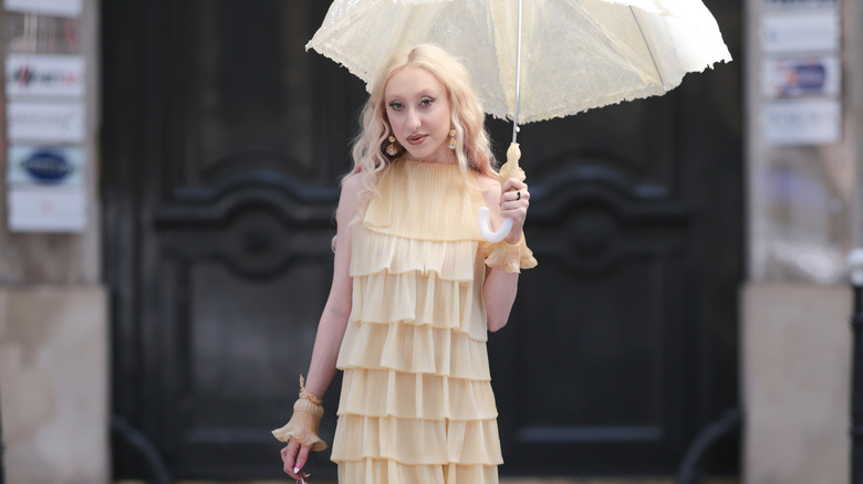
Just when it seemed like butter yellow might be another fleeting fashion craze, the soft pastel has proven it has real staying power. After dominating the runways throughout 2025, the creamy hue has continued to pop up everywhere from celebrity wardrobes to high-street collections, earning its reputation as fashion's newest neutral. Its appeal lies in its versatility — it's softer than sunshine yellow, warmer than cream, and surprisingly easy to style with pieces you probably already own. It's the on-trend color you should add to all your outfits. As Selfridges buying manager Laurie Field told Euronews, butter yellow's appeal comes from its versatility, with the shade working effortlessly with everything from tailoring to accessories.
To help take the guesswork out of styling this enduring trend, Women spoke exclusively with Rayne Parvis, a Style Coach and color analyst based in Los Angeles. Parvis believes butter yellow has stuck around because it's approachable. "It's the perfect way to play with color if you want something other than a tried-and-true neutral but not too bold," she tells Women. "It's soft, warm, and adds just enough color to make your outfit feel a little more fresh and current without making you feel like everyone is staring at you." Whether you prefer classic neutrals, bold color blocking, or transitional fall dressing, these are the shades she recommends pairing with your butter yellow looks.
Easy neutrals make butter yellow feel effortlessly chic
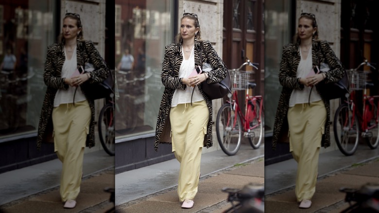
One of butter yellow's biggest strengths is how easily it can pair with many of the wardrobe basics you probably already own. Rather than competing with crisp white, cream, taupe, or light-wash denim, the buttery hue softens these staples and gives them a fresh update. Parvis says white creates the perfect balance because 'white is crisp and butter yellow is soft ... together they create a contrast that makes an outfit instantly more interesting than 'all white.'" She also recommends cream for anyone who loves tonal dressing, explaining that the pairing 'feels elevated, while also looking relaxed and effortless.' That versatility is exactly why personal stylist Dacy Gillespie told Forbes, "Butter yellow is easy to style because it pairs well with both saturated colors and other lighter pastel colors." Together, those shades make butter yellow feel less like a trend and more like another neutral in your closet.
Metallic accessories can completely change the look
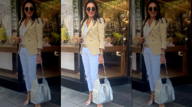
The jewelry you choose can completely transform a butter yellow outfit. According to Parvis, silver accessories add a modern edge that balances out butter yellow's softness, while gold enhances its warmth for a more sun-kissed finish. "Gold accessories ... bring out the warmth in butter yellow and take the vibe from relaxed and cozy to glam with a sun-kissed sparkle," she explains, exclusively. Celebrity stylist Erin Walsh also highlighted the foundational role of deliberate accessorizing when discussing her intentional dressing philosophy with Who What Wear, explaining that jewelry and styling details are a way to 'anchor a look and make it feel more grounded.' By intentionally choosing your metallic finish, you decide whether your butter yellow outfit reads as effortlessly laid-back or polished and elevated.
Lavender is the easiest way to try color blocking
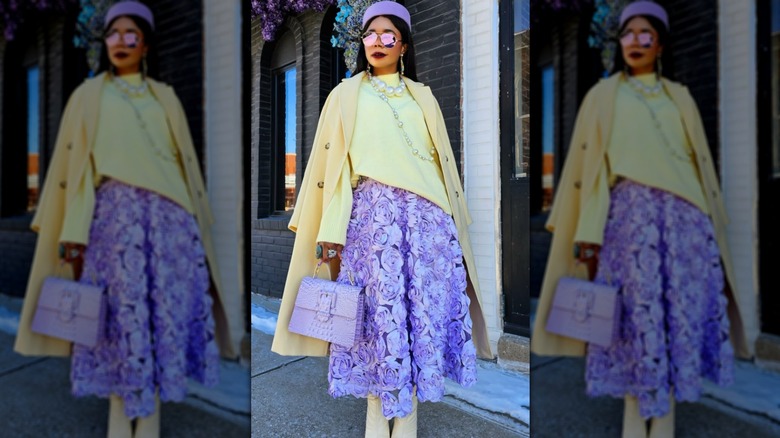
If you're ready to experiment beyond neutrals, butter yellow is surprisingly easy to color block with. Parvis recommends pairing it with lavender because the two shades share the same soft, optimistic quality. "Because they are both light, happy colors, they work really well together and create a playful look that's perfect for spring and summer," she says. The pairing feels fresh rather than loud, making it an approachable way to embrace color. That philosophy aligns with Tibi founder Amy Smilovic's approach to styling. Speaking to Vogue about her methodology for mixing soft hues, she explained that understanding color combinations is about curating the exact mood you want to project. She noted that, while pairing light shades with dark neutrals can create a 'sharp' effect, mixing them with unexpected, softer tones makes the overall impact a bit 'more nuanced.'
Olive green gives butter yellow a fall refresh
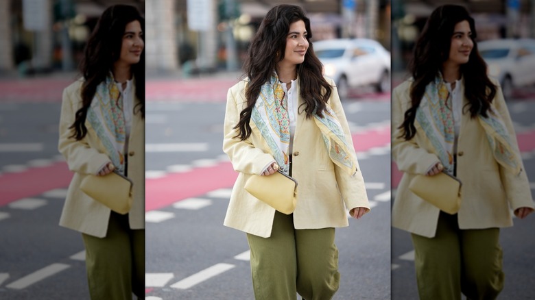
There's no reason to retire butter yellow once summer ends. According to Parvis, pairing it with olive green instantly gives the sunny shade a richer, more seasonal depth. "It gives the butter yellow a heavier feel, which helps to transition the color from warm summer days into the cooler fall weather," she explains exclusively to Women. Olive acts as an earthy anchor to butter yellow's lightness, toning down the bright impact without losing the optimism that makes this shade so appealing. It's an easy way to continue wearing your favorite summer pieces well into autumn.
Mocha brown makes butter yellow look more expensive
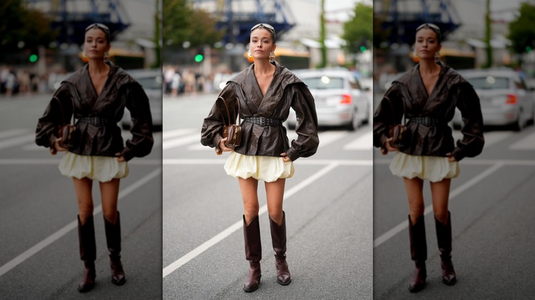
If olive green feels a little too casual, try swapping it for mocha brown. Rich chocolatey tones bring warmth and sophistication to butter yellow, creating a color combination that feels luxurious rather than overly sweet. "The richness of the mocha helps to make the butter yellow feel cozy, while also sophisticated," says Parvis. "This pairing proves butter yellow is not just a spring and summer color, but can absolutely elevate your fall looks as well." Her advice mirrors the growing embrace of brown as fashion's new black, particularly when paired with softer shades.
Butter yellow works because it acts like a neutral
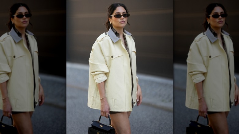
The secret to butter yellow's longevity isn't that it's replacing beige or white — it's that it behaves similarly to them. Whether you're pairing it with crisp neutrals, metallic accessories, soft pastels, or autumnal earth tones, the color can adapt to almost every outfit. As Parvis explains, butter yellow offers up 'just enough color' to refresh an outfit without feeling intimidating. That's why fashion insiders increasingly refer to it as the new neutral, with Lisa Illis telling Stylist that the buttery pastel has become a customer favorite because it's a 'transitional spring [color]' that functions like a neutral while bringing warmth and freshness to everyday dressing.